In [2]:
Hs = 1.75 + np.random.randn(1000,1)*0.1
plt.hist(Hs,30, facecolor=niceblu,edgecolor="w",lw=0.5)
plt.xlabel("Height [m]")
plt.ylabel("Number of subjects")
plt.show()

# make figures better:
font = {'weight':'normal','size':20}
matplotlib.rc('font', **font)
matplotlib.rc('figure', figsize=(9.0, 6.0))
matplotlib.rc('xtick.major', pad=10) # xticks too close to border!

import warnings
warnings.filterwarnings('ignore')

import random, math
import numpy as np
import scipy, scipy.stats

import matplotlib.pyplot as plt
from mpl_toolkits.basemap import Basemap
nicered = "#E6072A"
niceblu = "#424FA4"
nicegrn = "#6DC048"
James Bagrow, james.bagrow@uvm.edu, http://bagrow.com
Log-transforming "broad" data
Iterating plots to make appealing figures, maps, visualizations
In many physical systems a quantity is distributed "normally" in a bell curve around some central value. For example, the heights of humans.
You can see this distribution with a histogram:
Hs = 1.75 + np.random.randn(1000,1)*0.1

plt.hist(Hs,30, facecolor=niceblu,edgecolor="w",lw=0.5)
plt.xlabel("Height [m]")
plt.ylabel("Number of subjects")
plt.show()
It's called the "normal distribution" because it's so common.
You don't see humans walking around that are 20 meters tall, or 20 kilometers.
USA income distribution:
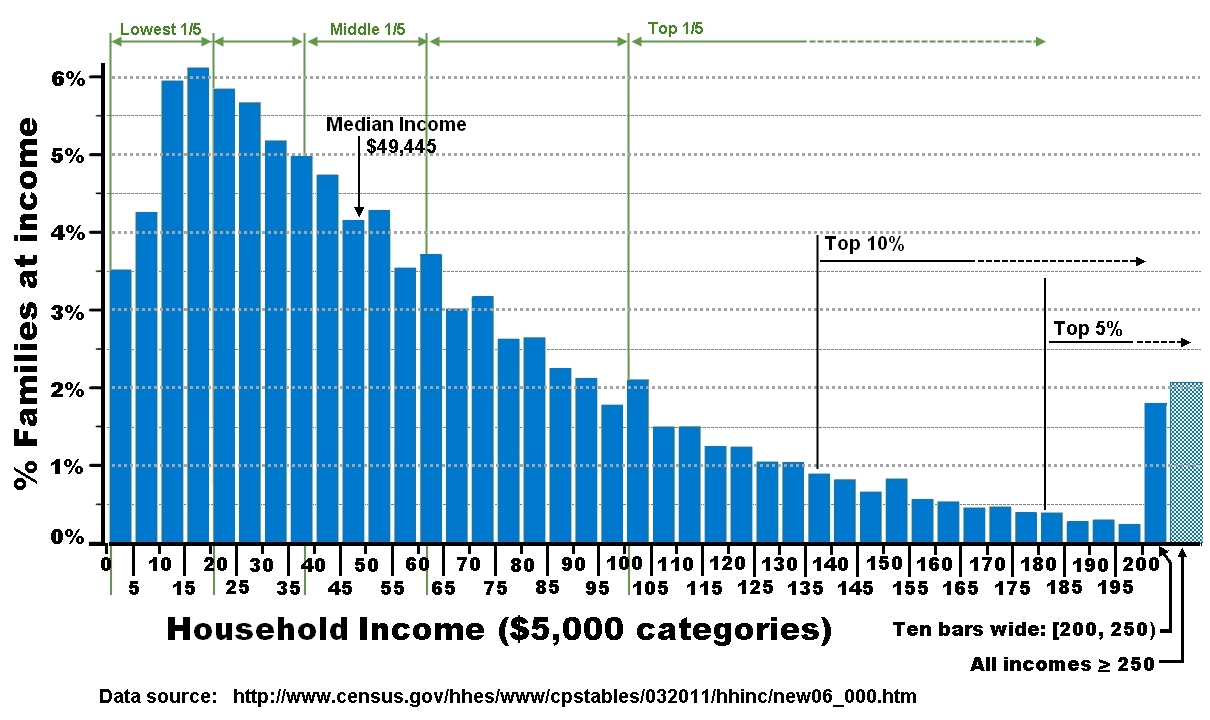
The top 20% earn at least five times what the bottom 20% can make.
And what about these people:


If we compute a histogram going from $5k/year of income to $500M/year, we're going to need a huge number of bins to cover that range, and almost all of the data is going to be crammed into the first few bins (covering everyone earning less than, say, $1M/year).
Broad data covers a very large range of values. Much larger than you would see from a normal distribution.
It is skewed in one direction. You can see if this is happening by comparing the mean and the median:
data = np.random.pareto(1.0, 1000) # fake data!

print "   min = %10.4f" % min(data)
print "   max = %10.4f" % max(data)
print "  mean = %10.4f" % np.mean(data)
print "median = %10.4f" % np.median(data)
If we try to make a histogram, we're going to have a bad time:
plt.hist(data,30, facecolor=niceblu,edgecolor="w",lw=0.5)
plt.xlabel("X")
plt.ylabel("P(x)")
plt.show()

We can use more bins and zoom in, but we're still not going to see much:
plt.hist(data,300, facecolor=niceblu,edgecolor="w",lw=0.5)
plt.xlabel("X")
plt.ylabel("P(x)")
plt.xlim([0,100])
plt.show()

Solution Do a nonlinear plot
The function \(y= \log(x)\) grows very very slowly. * We can make \(x\) HUGE and the log will just cram it way down to a small number
Let's see this:
x = linspace(1,1000,400)
y = np.log(x)

plt.plot(x, y, '-', lw=3 )
plt.xlabel("X")
plt.ylabel("Y = ln(X)")
plt.title("Linear plot")
plt.show()

What if we can stretch the x-axis in such a way to cancel out how slow this is growing...
plt.semilogx(x, y, '-', lw=3)
#   ^^^^^

plt.xlabel("X")
plt.ylabel("Y = ln(X)")
plt.title("Nonlinear plot!")
plt.show()

We can change space as we move along the x-axis, squashing larger and larger chunks into a given visual length in such as way that the slow-growing log function now appears linear!
What plt.semilogx is doing is log-transforming the X-data. This is the same as:
plt.plot(np.log10(x), y, lw=3)

plt.xlabel("log(X)")
plt.ylabel("Y = ln(X)")
plt.show()

The only difference is that plt.semilogx is smart enough to nicely label the x-axis with \(10^0\) instead of \(0\), \(10^1\) instead of \(1\), \(10^2\) instead of \(2\), etc.
So what? Why is this helpful?
The wealth data is too broad to see what is happening. The log is a squashing function.
plt.hist( np.log10(data), bins=30, facecolor=niceblu)

plt.xlabel("log10(data)")
plt.ylabel("Count")
plt.show()

WOW!
The rightmost bin with data looks to be a little beyond 3. That means those points have value around \(10^3\) because we took log base 10
We transformed the data and then binned and plotted it. What happens if we bin the original data and then plot that on a log-axis?
plt.hist( data, bins=30, facecolor=niceblu)

plt.xlabel("X")
plt.ylabel("Count(X)")
plt.gca().set_xscale('log')

plt.show()

Whoa That ain't right.
All we've done is taken the original bins and stretched them logarithmically. That one huge bin still contains almost 90% of the data.
To make a nice plot, what we should do is choose non-uniform bins. If you choose bins that are spaced wider and wider apart, the log will squash them down until (if chosen well) they are all the same width on the logarithmic scale:
plt.hist(data, bins=np.logspace(-4, 4, 30), facecolor=niceblu)
#                      ^^^^^

plt.xlabel("X")
plt.ylabel("Count(X)")
plt.gca().set_xscale('log')
plt.show()

Sometimes both your X- and your Y-values are broadly distribued. We can also log-transform Y.
If we plot a function \(y=f(x)\) on a plot where both the X- and the Y-scales are logarithmic and we see a straight line what kind of function is \(f\)?
Ans: power function.
\[y = A x^b\]
To see this take the log of both sides and replace \(\log(y) \to y'\) and \(\log(x) \to x'\).
\[ \log(y) = \log(A x^b) = \log(A) + \log(x^b) = A' + b \log(x) \]
so
\[y' = A' + b x'\]
which is a straight line when we plot \(x'\) vs. \(y'\).
Let's see this in action:
data = np.random.pareto(2.0, 10000)+1

minx = min(data)
maxx = max(data)

num_bins = 100
bin_edges = np.logspace(np.log10(minx),np.log10(maxx),100)

plt.hist(data, bins=bin_edges)

plt.xlabel("X")
plt.ylabel("Count(X)")
plt.gca().set_xscale('log')
plt.gca().set_yscale('log')
plt.show()

The bars aren't being drawn properly because the bottoms of the bars don't appear on a log-axis (\(log(0) \to -\infty\))
So better to just plot a scatter:
ys,bes = np.histogram(data,bins=bin_edges, density=True)
xs = 0.5*(bes[1:]+bes[:-1]) #              ^^^^^^^^^^^^

# double log
plt.loglog(xs,ys,'o-')

plt.xlabel("X")
plt.ylabel("Prob(X)")
plt.gca().set_xscale('log')
plt.gca().set_yscale('log')
plt.show()

So if you do a double-log plot and you see a straight line or something close to a straight line, you're learning something about the functional form of your data!
The time you put into making a figure/plot/visualization shows through in its quality. There's no free lunch.
Avoid defaults, tailor and style everything to the data to maximize impact.
Let's look at some examples.
A bar chart is a great way to summarize a small collection of numbers.
Bars can be grouped, presented vertically or horizontally, organized by color. Errorbars can be glued onto the bars to represent confidence intervals or variance.
CDC report on health care, 2009-10.
This report establishes a consistent color theme (blue/green for employed/unemployed)
The pie chart is labeled with percentages and names for each category
The subsequent bar charts remain self-contained due to useful legends. I don't need to refer to the pie chart to distinguish blue and green bars.
The effort put in to nicely label a figure makes it highly glanceable!
The blue and green being used are not pure blue (RGB(0,0,1)) or pure green (RGB(0,1,0)) which look sloppy in my opinion. Take some time to find decent colors.
Text is a good size for reading and does not overlap. Labels are short and to-the-point. White text is always used over dark colors and black text over light colors.
# data:
N = 5
menMeans = (20, 35, 30, 35, 27)
menStd   = ( 2,  3,  4,  1,  2)

womenMeans = (25, 32, 34, 20, 25)
womenStd   = ( 3,  5,  2,  3,  3)


ind = np.arange(N) # the x locations for the groups
width = 0.3        # the width of the bars

rects1 = plt.bar(ind,       menMeans,   width, yerr=menStd,   color='r')
rects2 = plt.bar(ind+width, womenMeans, width, yerr=womenStd, color='b')

plt.ylabel('Scores')
plt.title('Scores by group and gender')

plt.legend( (rects1[0], rects2[0]), ('Men', 'Women') )
plt.show()

OK, this is a fine start, especially given the book keeping we needed to do to get the bars to group nicely.
But it can be made much much better in my opinion:
Let's give it another go:
width=0.3333
orangecol = "#F9A65A"
bluecol   = "#599AD3"


rects1 = plt.bar(ind-width, menMeans, width, yerr=menStd,
                 error_kw={"ecolor":"DarkOrange","lw":4,
                           "capsize":8,"capthick":3},
                 color=orangecol, lw=0, alpha=0.5)

rects2 = plt.bar(ind, womenMeans, width, yerr=womenStd,
                 error_kw={"ecolor":bluecol,"lw":4,
                           "capsize":8,"capthick":3},
                 color=bluecol, lw=0, alpha=0.5)


plt.xlabel("Group")
plt.ylabel('Scores')
plt.xticks(ind, ('1', '2', '3', '4', '5') )

plt.legend( (rects1[0], rects2[0]), ('Men', 'Women'),
            fontsize=18, frameon=False )

# add space to left and right:
plt.xlim([0-2*width,4+2*width])

plt.show()

Let's iterate one more time:
rects1 = plt.bar(ind-width, menMeans, width, yerr=menStd,
                 error_kw={"ecolor":"DarkOrange","lw":4,
                           'zorder':10,
                           "capsize":8,"capthick":3},
                 color=orangecol, lw=0, alpha=0.5)

rects2 = plt.bar(ind, womenMeans, width, yerr=womenStd,
                 error_kw={"ecolor":bluecol,"lw":4,
                           'zorder':10,
                           "capsize":8,"capthick":3},
                 color=bluecol, lw=0, alpha=0.5)


plt.xlabel("Group")
plt.ylabel('Scores')
plt.xticks(ind, ('1', '2', '3', '4', '5') )

plt.legend( (rects1[0], rects2[0]), ('Men', 'Women'),
            fontsize=18, frameon=False )

# add space to left and right:
plt.xlim([0-2*width,4+2*width])

ax = plt.gca() # gca = "get current axes"

# HERE IS THE NEW PART:
for x,y,e in zip(ind,menMeans,menStd):
    string = '%d' % int(y)
    ax.text( x-width/2, y+e+0.5, string, fontsize=16,
            ha='center', va='bottom')
for x,y,e in zip(ind,womenMeans,womenStd):
    string = '%d' % int(y)
    ax.text( x+width/2, y+e+0.5, string, fontsize=16,
            ha='center', va='bottom')


# need to make more vertical space for the labels:
plt.yticks([0,10,20,30,40])
plt.ylim([0, 45])

plt.grid(axis="y",color="w",linewidth=1, linestyle="-")

plt.show()

Little annotations can really help a lot, but you need to really customize things.
Maybe this was too much, both the numeric labels and the horizontal guides. Pick and choose.
We've been working with these for a while. What more can we do?
# Create some dummy data
def measure(n):
    "Measurement model, return two coupled measurements."
    m1 = np.random.normal(size=n)
    m2 = np.random.normal(scale=0.5, size=n)
    return m1+m2, m1-m2

m1, m2 = measure(2000)
xmin,xmax = m1.min(),m1.max()
ymin,ymax = m2.min(),m2.max()


print "Regular scatter boring and a little ugly..."
plt.scatter(m1,m2);
plt.xlabel("X");plt.ylabel("Y")
plt.show()

It's really boring to use the defaults scatter points (blue filled circles with black edges).
Let's make this better:
print "Slightly better...?"
plt.scatter(m1,m2, s=80, facecolor=niceblu,edgecolor='none',alpha=0.25);

plt.axis([-5,5,-5,5])
plt.gca().set_aspect("equal")
plt.gca().spines['right'].set_visible(False)
plt.gca().spines['top'  ].set_visible(False)
plt.gca().xaxis.set_ticks_position('bottom')
plt.gca().yaxis.set_ticks_position('left')

plt.xlabel("X");plt.ylabel("Y")
plt.show()

That's a little more appealing. The dark blue in the center also gives us a little information about how dense the points are.
Another variation:
print "Or maybe like this?"
plt.scatter(m1,m2, s=80, facecolor=nicered,edgecolor='none',alpha=0.25);

plt.axis([-5,5,-5,5])
plt.xticks( [-4,-2,0,2,4] )
plt.gca().set_aspect("equal")
plt.grid('on')
plt.text(-4.5,4, "Here is the\nred data",color=nicered,
         horizontalalignment='left',
         verticalalignment='top'
        )

plt.xlabel("X");plt.ylabel("Y")
plt.show()

Even after prettying up the points, scatter plots can still be a little boring.
Let's do something a little far out there:
The easiest way to do this is with a 2D histogram. From wikipedia:
# Make a 2D histogram
H, xedges, yedges = np.histogram2d(m1, m2, bins=(20, 20))

# H is a matrix, we can plot it by treating it as an "image":

extent = [xmin, xmax, ymin, ymax]

plt.imshow(H, extent=extent, interpolation='nearest',origin="lower")

plt.colorbar(label="Number of points")
plt.xlabel("X");plt.ylabel("Y")
plt.show()

That shows us the density of points, or at least it gives us an estimate. And we can control the appearance, for example the colormap:
# try three different colormaps in a loop:
for cm in [plt.cm.hot, plt.cm.Blues,plt.cm.gist_earth_r]:
    plt.imshow(H, extent=extent, cmap=cm,
               interpolation='nearest',origin="lower")
    plt.xlabel("X");plt.ylabel("Y")
    plt.title("colormap = %s" % cm.name)
    plt.box("off")
    plt.show()


OK, so we can get at the underlying density and we have some style options.
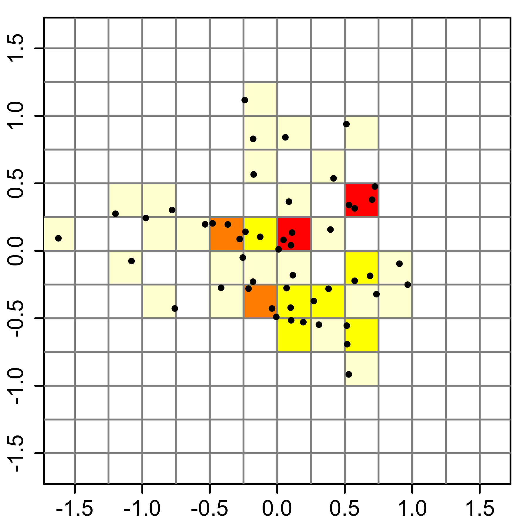
You may think drawing boxes is boring. Even though it doesn't give much more information, you can use hexagons instead of squares:
print "Hex binning, but messed up aspect ratio..."
plt.hexbin(m1,m2, cmap=plt.cm.jet,gridsize=25)
plt.axis([xmin, xmax, ymin, ymax])
plt.title("Hexagon binning")
cb = plt.colorbar()
cb.set_label('counts')
plt.show()

print "Fix the aspect ratio..."
plt.hexbin(m1,m2, cmap=plt.cm.Greens, gridsize=25)
plt.axis([xmin, xmax, ymin, ymax])
plt.gca().set_aspect('equal')

cb = plt.colorbar()
cb.set_label('counts')
cb.outline.set_color('white')
plt.box("off")
plt.tick_params(
    axis='both',       # changes apply to both x-axis and y-axis
    which='both',      # both major and minor ticks
    bottom='off',      # ticks along the bottom edge are off
    top='off',         # ticks along the top edge are off
    left="off",        # ticks along left are off
    right="off",       # ticks along right are off
    labelleft="off",   # turn off y-axis tick labels
    labelbottom='off') # labels along the bottom edge are off
plt.show()


Looking high tech!
Here's a killer hexbin example, in practice:
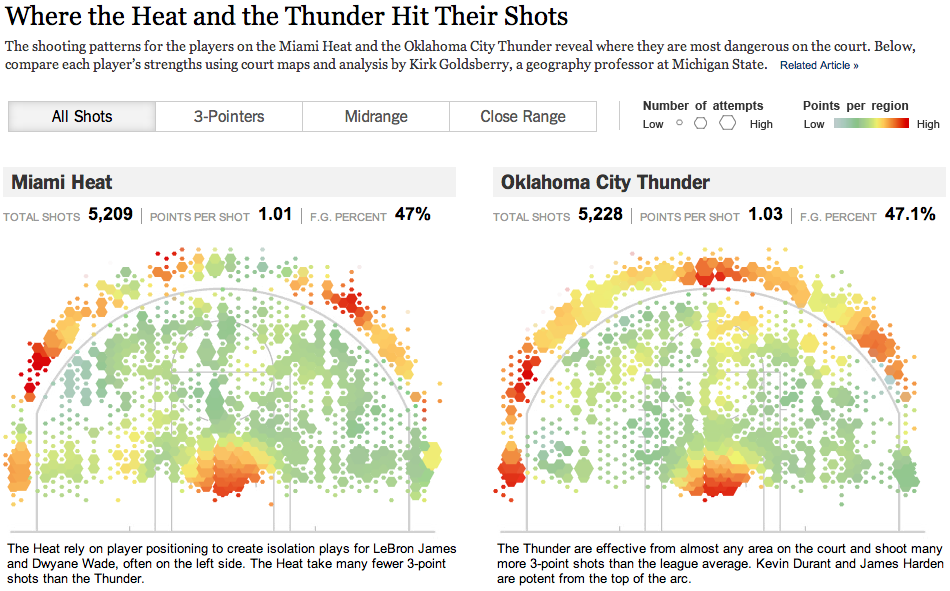
This hexbinning is even more extreme because they are representing two datapoints at each bin:
It's a lot of work to get such a nice data visualization. We're building up to their level, but the NYT data team are masters.
What can we do? We can use the scatter function to make a variable-size, variable-color hexagon scatter plot:
num = 100
# some crazy color function:
T = np.arctan2(m2[:num],m1[:num])
# some crazy size function:
S = 100*T+400

plt.scatter(m1[:num],m2[:num], # plot first `num` points
            s=S, c=T,
            cmap=plt.cm.RdYlGn_r,
            edgecolor='none', alpha=0.80, marker='H'
            )
# another way to turn off tick labels
plt.xticks([])
plt.yticks([])
plt.gca().set_aspect('equal')
# customize the frame/border around the plot:
for nm in ["top","bottom","left","right"]:
    plt.gca().spines[nm].set_color("LightGray")
    plt.gca().spines[nm].set_linewidth(3)
plt.show()

But note that this example is not a binning! We are adding fake size and color data. You would have to write your own code to fully transform your data into the numbers needed for this plot...
plt.scatter knows nothing about binning, it just draws points. You need to compute the data to assign to those points (location, size, color)Still a long way from that NBA viz, but most of the individual ingredients are there!
We have one more trick we can mess around with.

Just like we can do a 2D histogram, we can do a 2D KDE!

# combine the XY-data into a single 2D matrix/array:
values = np.vstack([m1, m2])

# Perform a kernel density estimate on the data:
kernel = scipy.stats.gaussian_kde(values)
# ^ This is a function...

# build a grid of 200 points evenly spaced between
# minx and max, and  miny and maxy.
X, Y = np.mgrid[ xmin:xmax:200j, ymin:ymax:200j ]
positions = np.vstack([X.ravel(), Y.ravel()])


# make a matrix of the kernel probabilities along the XY-grid:
Z = np.reshape( kernel(positions).T, X.shape )

dx,dy = 0.1,0.1 # padding around data

plt.imshow(np.rot90(Z), cmap=plt.cm.hot,#plt.cm.gist_earth_r,
           extent=[xmin-dx, xmax+dx, ymin-dy, ymax+dy])
cb = plt.colorbar()
cb.set_label("Probability density")
plt.show()

plt.imshow(np.rot90(Z), cmap=plt.cm.gist_earth_r,
           extent=[xmin-dx, xmax+dx, ymin-dy, ymax+dy])
plt.show()

plt.imshow(np.rot90(Z), cmap=plt.cm.jet,
           extent=[xmin-dx, xmax+dx, ymin-dy, ymax+dy])
plt.grid(color='w')
plt.show()


Now let's add a linear trendline via a regressed fit:
m,b,r,p,se = scipy.stats.linregress(m1,m2)

x_fit = np.linspace(xmin-dx,xmax+dx,100)
y_fit = [m*x+b for x in x_fit]


print "First try..."
plt.hold(True)
plt.imshow(np.rot90(Z), cmap=plt.cm.jet,
           extent=[xmin-dx, xmax+dx, ymin-dy, ymax+dy])
plt.plot(x_fit,y_fit, lw=2,c='w')
plt.show()

print "\nNeed to fix xlim,ylim..."
plt.hold(True)
plt.imshow(np.rot90(Z), cmap=plt.cm.jet,
           extent=[xmin-dx, xmax+dx, ymin-dy, ymax+dy])
plt.plot(x_fit,y_fit, lw=4,c='w')
plt.xlim([xmin-dx, xmax+dx])
plt.ylim([ymin-dy, ymax+dy])
plt.xlabel("X variable"); plt.ylabel("Y variable")
plt.box("off")
plt.show()


A lot of you have projects that can benefit from drawing maps.
Let's give a brief overview of how to do some mapping in python.
Drawing maps is surprisingly hard!
You need to take your map data (collections of latitude,longitude pairs) and project them from the sphere (actually the earth's shape is called a "geoid") onto the 2D plane.
There is a companion package to matplotlib called Basemap
Here's an example:
from mpl_toolkits.basemap import Basemap


# set up orthographic map projection with
# perspective of satellite looking down at 50N, 100W.
# use low resolution coastlines.
map = Basemap(projection='ortho',lat_0=45,lon_0=-100,resolution='l')

# draw coastlines, country boundaries, fill continents.
map.drawcoastlines(linewidth=0.25)
map.drawcountries(linewidth=0.25)
map.fillcontinents(color='coral',lake_color='aqua')

# draw the edge of the map projection region (the projection limb)
map.drawmapboundary(fill_color='aqua')

# draw lat/lon grid lines every 30 degrees.
map.drawmeridians(np.arange(0,360,30))
map.drawparallels(np.arange(-90,90,30))


# make up some data on a regular lat/lon grid.
nlats = 73; nlons = 145; delta = 2.*np.pi/(nlons-1)
lats = (0.5*np.pi-delta*np.indices((nlats,nlons))[0,:,:])
lons = (delta*np.indices((nlats,nlons))[1,:,:])
wave = 0.75*(np.sin(2.*lats)**8*np.cos(4.*lons))
mean = 0.5*np.cos(2.*lats)*((np.sin(2.*lats))**2 + 2.)

# compute native map projection coordinates of lat/lon grid.

x, y = map(lons*180./np.pi, lats*180./np.pi)

# contour data over the map.
cs = map.contour(x,y,wave+mean,15,linewidths=1.5)


plt.show()

Here's another example showing US cities and their populations:
#plt.close('all')

# Data of city location (logitude,latitude) and population

pop={'New York':8244910,'Los Angeles':3819702,
'Chicago':2707120,'Houston':2145146,
'Philadelphia':1536471,'Pheonix':1469471,
'San Antonio':1359758,'San Diego':1326179,
'Dallas':1223229,'San Jose':967487,
'Jacksonville':827908,'Indianapolis':827908,
'Austin':820611,'San Francisco':812826,
'Columbus':797434} # dictionary of the populations of each city

lat={'New York':40.6643,'Los Angeles':34.0194,
'Chicago':41.8376,'Houston':29.7805,
'Philadelphia':40.0094,'Pheonix':33.5722,
'San Antonio':29.4724,'San Diego':32.8153,
'Dallas':32.7942,'San Jose':37.2969,
'Jacksonville':30.3370,'Indianapolis':39.7767,
'Austin':30.3072,'San Francisco':37.7750,
'Columbus':39.9848} # dictionary of the latitudes of each city

lon={'New York':73.9385,'Los Angeles':118.4108,
'Chicago':87.6818,'Houston':95.3863,
'Philadelphia':75.1333,'Pheonix':112.0880,
'San Antonio':98.5251,'San Diego':117.1350,
'Dallas':96.7655,'San Jose':121.8193,
'Jacksonville':81.6613,'Indianapolis':86.1459,
'Austin':97.7560,'San Francisco':122.4183,
'Columbus':82.9850} # dictionary of the longitudes of each city


# build the map:
m = Basemap(llcrnrlon=-119,llcrnrlat=22, # define map corners
            urcrnrlon=-64, urcrnrlat=49,
            projection='lcc', # lambert conformal conic project
            lat_1=33,lat_2=45,lon_0=-95,resolution='c')

# draw the US:
m.drawcoastlines()
m.drawstates()
m.drawcountries()

# draw the cities as translucent circles:
max_size=2000
for city in lon.keys():
    x, y = m(-lon[city],lat[city])
    m.scatter(x,y,max_size*pop[city]/pop['New York'],
              marker='o',color=niceblu, alpha=0.5)
plt.show()

The shortest path between two points on a globe is not a line but a segment of a circle known as a great circle.
# create new figure, axes instances.
fig=plt.figure()
ax=fig.add_axes([0.1,0.1,0.8,0.8])
# setup mercator map projection.
m = Basemap(llcrnrlon=-100.,llcrnrlat=00.,
            urcrnrlon=10.,  urcrnrlat=60.,
            resolution='l',projection='merc'
           )

# nylat, nylon are lat/lon of New York
nylat = 40.78; nylon = -73.98
# lonlat, lonlon are lat/lon of London.
lonlat = 51.53; lonlon = 0.08

# draw great circle route between NY and London
m.drawgreatcircle( nylon, nylat,
                  lonlon,lonlat,
                  linewidth=5,color=nicegrn, solid_capstyle="round" )

# draw great circle route between Miami and Madrid
m.drawgreatcircle(    -80.28,      25.82,
                  -3.7025600, 40.4165000,
                  linewidth=5,color=nicered, solid_capstyle="round" )

m.drawcoastlines()
m.drawcountries()
#m.drawparallels(np.arange(10,90,20),   labels=[1,1,0,1])
#m.drawmeridians(np.arange(-180,180,30),labels=[1,1,0,1])
m.drawmapboundary(fill_color="#F0F8FF")
m.fillcontinents(color="#DDDDDD",lake_color="#F0F8FF")
#plt.gca().axis("off")
plt.show()

These arcs can be used to visualize travel or communication data, for example.
Here's another big example called a choroplenth. It's a map of the population density of the US by state. The population density is represented by the color of the state's polygon.
from matplotlib.collections import LineCollection
from matplotlib.colors import rgb2hex

# Lambert Conformal map of lower 48 states.
m = Basemap(llcrnrlon=-119,llcrnrlat=22,
            urcrnrlon=-64, urcrnrlat=49,
            projection='lcc', lat_1=33,lat_2=45,lon_0=-95)

# laod state boundaries.
# data from U.S Census Bureau
# http://www.census.gov/geo/www/cob/st1990.html
shp_info = m.readshapefile('gz_2010_us_040_00_500k','states',drawbounds=False)
# This loads three files:
#   gz_2010_us_040_00_500k.dbf
#   gz_2010_us_040_00_500k.shp
#   gz_2010_us_040_00_500k.shx


# population density by state from
# http://en.wikipedia.org/wiki/List_of_U.S._states_by_population_density
popdensity = {
'New Jersey': 438.00,
'Rhode Island': 387.35,
'Massachusetts': 312.68,
'Connecticut': 271.40,
'Maryland': 209.23,
'New York': 155.18,
'Delaware': 154.87,
'Florida': 114.43,
'Ohio': 107.05,
'Pennsylvania': 105.80,
'Illinois': 86.27,
'California': 83.85,
'Hawaii': 72.83,
'Virginia': 69.03,
'Michigan': 67.55,
'Indiana': 65.46,
'North Carolina': 63.80,
'Georgia': 54.59,
'Tennessee': 53.29,
'New Hampshire': 53.20,
'South Carolina': 51.45,
'Louisiana': 39.61,
'Kentucky': 39.28,
'Wisconsin': 38.13,
'Washington': 34.20,
'Alabama': 33.84,
'Missouri': 31.36,
'Texas': 30.75,
'West Virginia': 29.00,
'Vermont': 25.41,
'Minnesota': 23.86,
'Mississippi': 23.42,
'Iowa': 20.22,
'Arkansas': 19.82,
'Oklahoma': 19.40,
'Arizona': 17.43,
'Colorado': 16.01,
'Maine': 15.95,
'Oregon': 13.76,
'Kansas': 12.69,
'Utah': 10.50,
'Nebraska': 8.60,
'Nevada': 7.03,
'Idaho': 6.04,
'New Mexico': 5.79,
'South Dakota': 3.84,
'North Dakota': 3.59,
'Montana': 2.39,
'Wyoming': 1.96,
'Alaska': 0.42}

# choose a color for each state based on population density.
colors={}
statenames=[]
cmap = plt.cm.Blues_r # use 'hot' colormap
vmin = 0; vmax = 450 # set range.
sm = plt.cm.ScalarMappable(cmap=cmap,
                           norm=plt.normalize(vmin=vmin, vmax=vmax))

for shapedict in m.states_info:
    statename = shapedict['NAME']

    try:
        pop = popdensity[statename]
    except KeyError:
        pop = 0.0

    # calling colormap with value between 0 and 1 returns
    # rgba value. Invert color range (hot colors are high
    # population), take sqrt root to spread out colors more.
    colors[statename] = cmap((pop-vmin)/(vmax-vmin))[:3]
    statenames.append(statename)

# cycle through state names, color each one.
for nshape,seg in enumerate(m.states):
    xx,yy = zip(*seg)
    if statenames[nshape] != 'District of Columbia' and \
       statenames[nshape] != "Puerto Rico":
        color = rgb2hex(colors[statenames[nshape]])
        plt.fill(xx,yy,color,edgecolor=color)

# draw meridians and parallels.
m.drawparallels(np.arange(25,65,20),   labels=[0,0,0,0],
                zorder=-1,color="w")
m.drawmeridians(np.arange(-120,-40,20),labels=[0,0,0,0],
                zorder=-1,color="w")

# set up colorbar:
mm = plt.cm.ScalarMappable(cmap=cmap)
mm.set_array([vmin,vmax])
plt.colorbar(mm, label="Population per km$^2$",
             ticks=[0,100,200,300,400],
             orientation="horizontal", fraction=0.05,
            )

#plt.title('Filling State Polygons by Population Density')
plt.gca().axis("off")
plt.show()

This example reads what is called a shapefile, a standard way to store map data (which is surprisingly nontrivial data).
The three files being read in the previous example (by m.readshapefile) are:
gz_2010_us_040_00_500k.dbf
gz_2010_us_040_00_500k.shp
gz_2010_us_040_00_500k.shx
You almost always want to find shapefiles online. I found these shape files from the US census: http://www2.census.gov/geo/tiger/GENZ2010/
Some of you may want to find shapefiles for Vermont, hint hint...